
- Project Overview & Goals
- Data Collection & Cleaning
- Data Analysis, Interpretation, & Visualization
- Recommendations
Project Overview & Goals
Urban Eden is a small, e-commerce business that sells “gardening solutions” for urban environments. They focus on selling eco-friendly plant containers and gadgets that are suited for small living spaces, like apartments. Some of their products include vertical wall planters, biodegradable planting pots, and compact compost bins as well as a suite of “plant-tech” products tied into their mobile app such as plant sensors that monitor soil moisture, temperature and sunlight levels; Bluetooth watering cans that allow users to set customized water schedules; and solar powered grow lights.
Since Urban Eden does not have any brick-and-mortar locations, they rely heavily on digital marketing to drive sales, generate revenue, and build their brand. Each year, they hold the “Urban Eden Annual Sale” which has historically corresponded to 35-40% of their annual revenue (i.e., the sale is SUPER critical to a successful year). Urban Eden wanted to put their best foot forward for the big sale, so they decided to run an email marketing campaign a month in advance to determine the best way to get their customers to make a purchase when the annual sale actually started. Using their customer database of about 200 emails, they conducted A/B testing for the sale of their vertical wall planters.
Below are the two different emails that were randomly sent to customers.


Once the campaign had finished, they sent the results over to me to analyze and offer recommendations to improve their campaign to ensure they were spending their marketing funds in the right places. (For instance, maybe email isn’t the best way to reach their customers and they should focus their spend on social media). Albeit, this is a pretty open-ended request; Urban Eden doesn’t have a clear idea of metrics they should be tracking nor do they know if they’re meeting them – that’s where I come in!
Data Collection & Cleaning
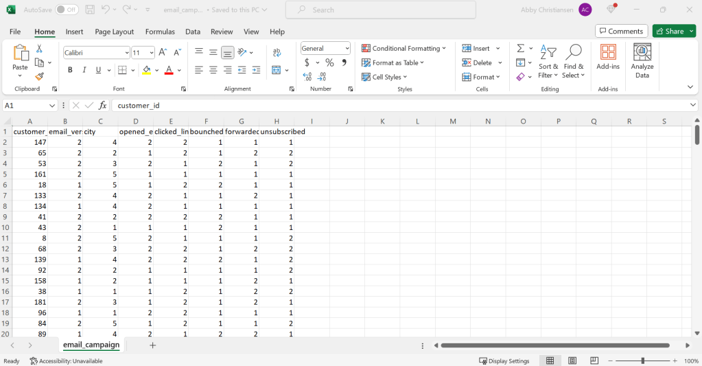
The first step to delivering the request of Urban Eden is to collect all of the data related to this campaign. Urban Eden is a relatively new company and they don’t have much budget to spend on data storage or collection software (they still keep their customer information stored in Excel files!). Platforms like HubSpot, MailChimp, and even Constant Contact are just a few recommendations that I could make to get them set up with a more efficient data collection, tracking, and analyzing process. But, for the purposes of this project, they sent me the results of the email campaign in an Excel file. The metrics they collected are as follows:
- Customer ID
- Email Version
- Location
- Email Opened?
- Link Clicked?
- Bounce?
- Forward?
- Unsubscribe?
For this data set, each email recipient has a unique customer ID. Customers were either sent Version 1 of the email or Version 2. The location where the customer resides was also collected. Various other metrics such as email opens, clicked links, bounces, forwards, and unsubscriptions were recorded.
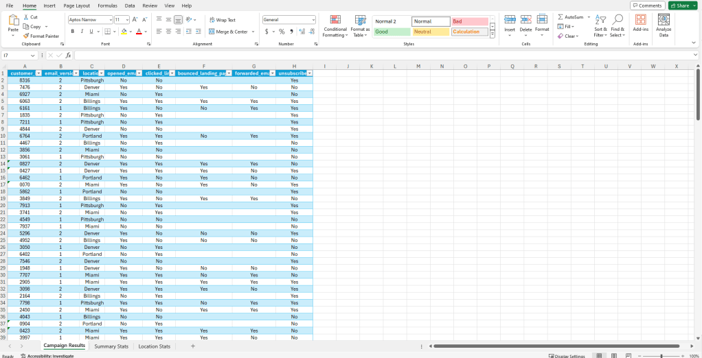
The data file generated is simply a numerical output for the campaign results. While the results are structured, i.e., the data has a standardized format of columns and rows, the data itself is simply a bunch of dots and dashes – it doesn’t mean much to the naked eye. Luckily, Urban Eden gave me a little clarity on what all the numbers refer to, a key if you will:
- Customer ID
- Unique Identifier
- Email Version
- Version 1 or Version 2
- City
- 1=Portland, 2=Eugene, 3=Medford, 4=Bend, 5=Ashland
- Email Opened?
- 1=Yes, 2=No
- Link Clicked?
- 1=Yes, 2=No
- Bounce?
- 1=Yes, 2=No
- Forward?
- 1=Yes, 2=No
- Unsubscribe?
- 1=Yes, 2=No
After a few simple functions and cleaning, the data already appears to be more meaningful.
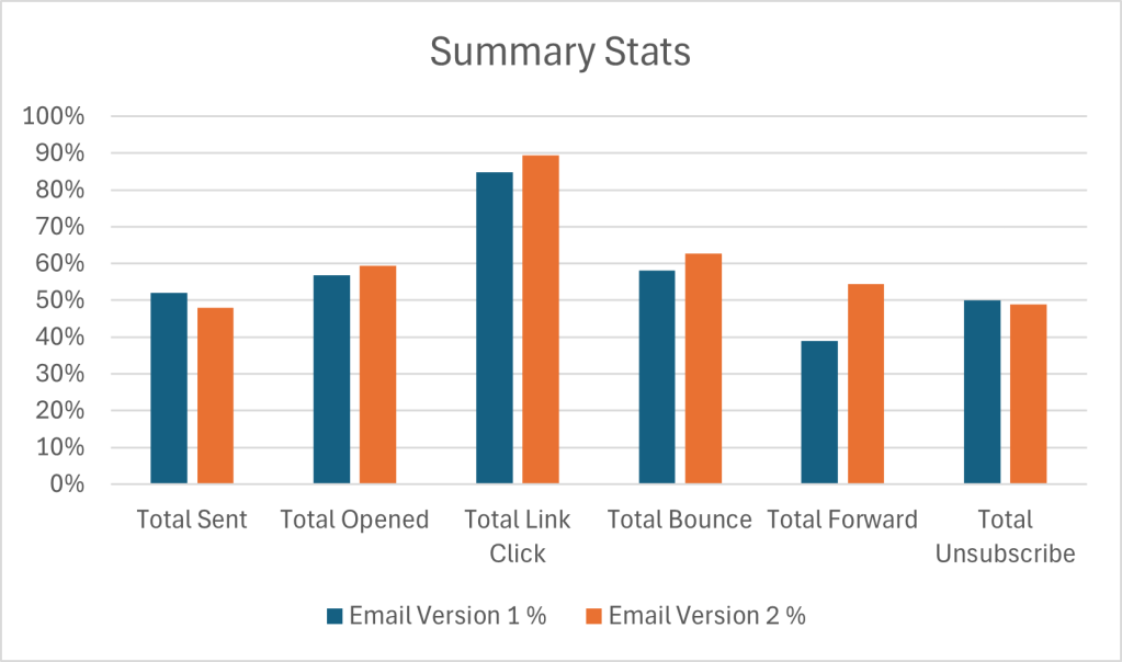
A key element of cleaning data is to verify its accuracy – while I have to trust that these results came from the described source (i.e., the email campaign), there are other methods to ensure the data is “accurate” such as running summary statistics. Below are the summary statistics of the two different emails that were sent out to customers. I also included a break down of key statistics based on location (the only demographic key I can rely on to sort data). If there is any obviously missing data, issues with formatting or syntax, or outliers, running summary statistics is a good way to get a feel for the accuracy of your data.
A note about data visualization: Many people make the assumption that data visualization is the “last step” in the data analysis process where information is presented in a clean, digestible manner. While it is a crucial piece of presenting key findings of a data set, I tend to find that integrating data visualization into the analysis process actually improves my ability to recognize, differentiate, and understand a complete picture of the data, especially since I’m working with a relatively small data set.
Check out these graphs:
Data Analysis, Interpretation, & Visualization
*Just a warning here: to do my due diligence I’m going to look at EACH individual piece of data in relation to the whole, so FYI it might get a little dry here lol. Feel free to skip on down to the exciting recommendations section if you wish to avoid hearing me drone on for too many paragraphs.
*Just one more note (sorry!): The main point of this section is to report on the results of the campaign. However, sprinkled throughout are “one-offs,” as I’ve come to call them, about potential reasons for the data behaving the way it is. This is my process for deriving some meaning from the data and does not fully constitute an explicit recommendation. You’ll have to wait for the Recommendations section for that 🙂
Comparing Email Versions
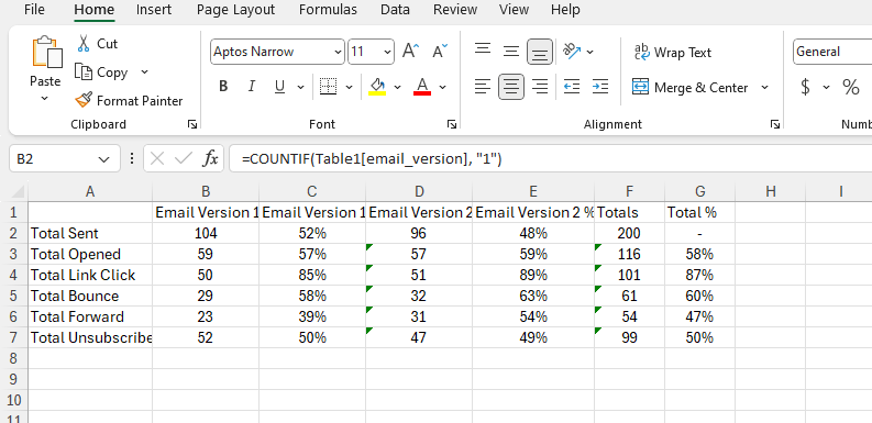
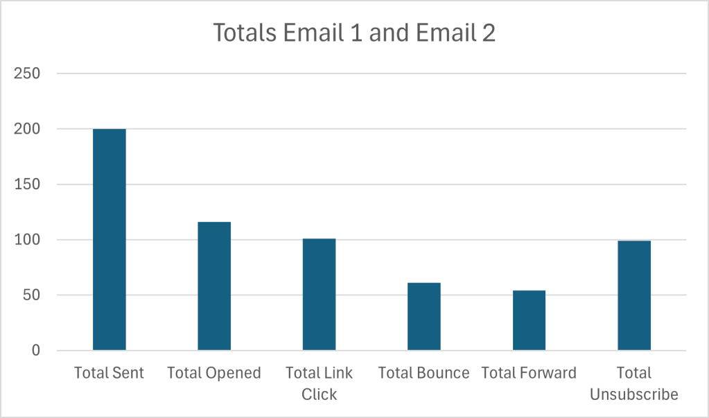
Of the 200 emails that were sent, 200 made it to inbox, whoo hoo! If there were issues with email delivery, i.e., Urban Eden intended to send 200 emails but only 180 were received by customers, there may be some issues with the email delivery service or they may want to clean their customer data for old or incorrect email information.
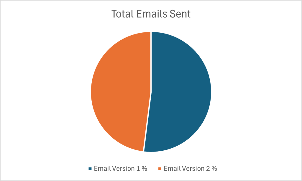
There were a total of 104 Version 1 emails sent and 96 Version 2 emails sent. This gives a relatively good model for comparing the results between the two versions as they were almost sent completely 50/50.
Email Version 1 had a 57% open rate and Email Version 2 had a 59% open rate. These are both very impressive open rates according to industry standards. (It’s important to reiterate that these numbers are incredibly made up and randomized, so they should not be construed as 100% accurate or realistic.)
The click-through-rate (CTR) for each email version was 85% and 89%, respectively. It’s great to see that both email versions drove customers to the landing page for the sale. Both emails had a “Shop Now!” link right below the second header, but above the featured image. These CTR results indicate that the location of the link appears to be in an appropriate spot.
Once customers clicked the link, they were directed to the same landing page.
58% of customers who discovered the page via Email Version 1 bounced off the landing page without continuing their journey, while 63% who landed on the page from Email Version 2 also bounced. While these numbers aren’t alarmingly different, the bounce rate from Email Version 2 is slightly higher, meaning more people left the site than those who arrived from Email Version 1. A few explanations for this could:
- Customers weren’t immediately able to find what they were looking for on the site.
- Customers weren’t ready to make a purchase or weren’t convinced they needed the product.
- Customers weren’t clear on “next steps,” i.e., a purchase.
The final two statistics collected for this campaign include how many times the emails were forwarded and how many people unsubscribed after receiving the email. Significantly, more people forwarded Email Version 2 (54%) than Email Version 1 (39%). A potential explanation could be related to the high bounce rates that Email 2 experienced: maybe customers were very interested in the product, but could not complete the purchase on the website (for a variety of reasons such as poor design or cost) and instead choose to forward the information to a friend, family member, or colleague who may also be interested (or as a hint to buy it for them!).
Further, if we dissect the content that was in the two emails (Version 1 showcased the product while Version 2 highlighted a human “lifestyle” image), we could also derive meaning from the higher forward rate on Email Version 2. People like people; they look for aspirational content. People also want to see other people, and seeing a product in use by someone is always more compelling than seeing a stock image of a product.
The final statistic is quite alarming – half of the people who received an email unsubscribed after receiving it (50% – Version 1, 49% – Version 2). At this point, the number of customers Urban Eden has in their database has just plummeted. Why are people choosing to stop receiving communication from them now? Is this a historical pattern or a new occurrence? (If we had historical data this could potentially be a question that could get answered).
Sales Funnel
This is a lot of information to digest, so here’s a visual representation of the sequence of events that occurs when an email from Urban Eden is sent.
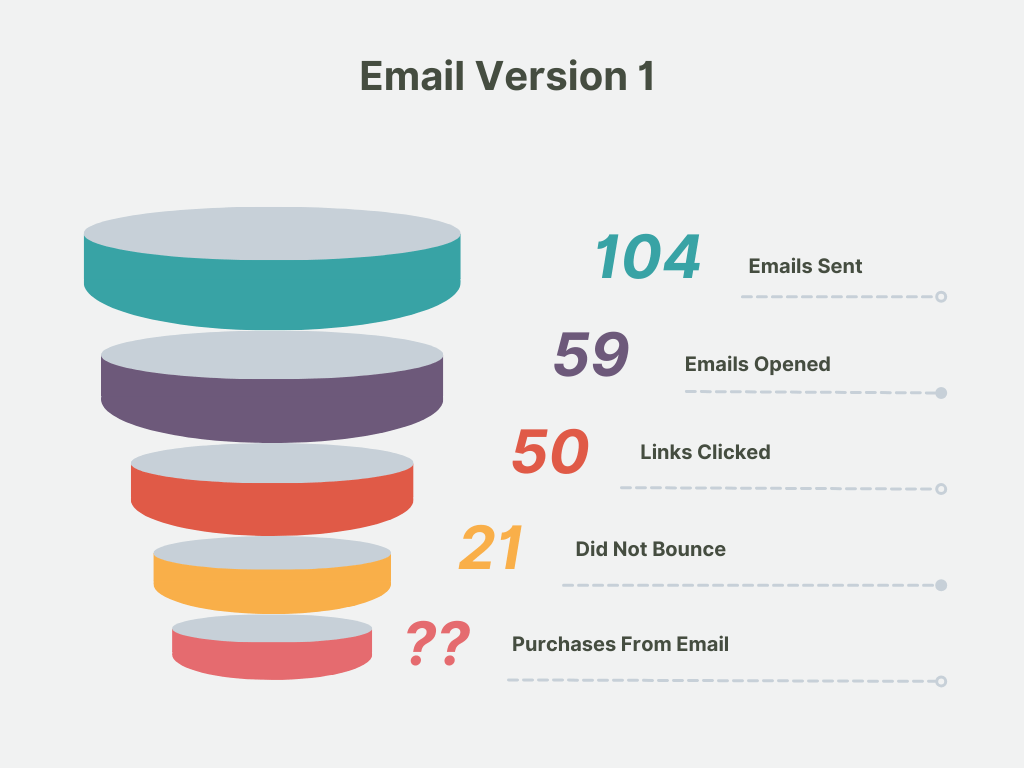

This visualization shows that Urban Eden is earning a very small payoff from their email marketing efforts. Only about ~25% of email recipients are staying on the landing page after clicking a link in an email and potentially making a purchase. Each additional action whittles down the number of people that could be seeing, interacting, or making a purchase. While this is a typical sales funnel and it would be impossible to reach everyone, some effort should be paid to assessing their recipient list and ensuring that people who want to see their content, do.
Comparing Campaign Results by Location
A great way to derive meaning from data (particularly in an e-commerce setting), is to map the customer journey: who are the people we are communicating with and how are they interacting with our content. Demographics are a simple way to assign meaning to otherwise irrelevant values, and (luckily!), we have the various cities our email respondents reside in to better understand the results of the A/B testing email campaign.
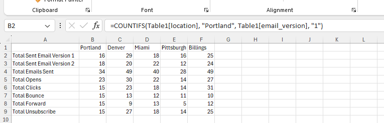
To gain some perspective here’s a breakdown of how many emails were sent per location:
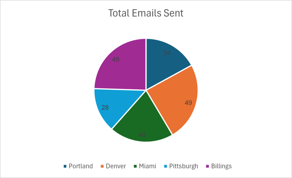
Overall, this is a relatively even distribution of emails sent per city. It does reveal that a big chunk of Urban Eden’s customers reside in Portland, Denver, and Miami. (While outside the scope of this project, this insight could lead to further data about the behaviors and habits of the highest volume locations of customers compared to places where Urban Eden doesn’t have established customer bases).
Next we can look at the variation of email versions sent per city. Here’s a big of a data dump:

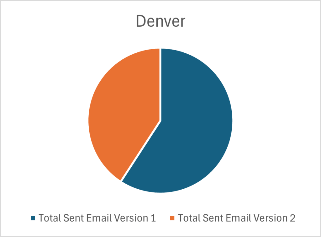

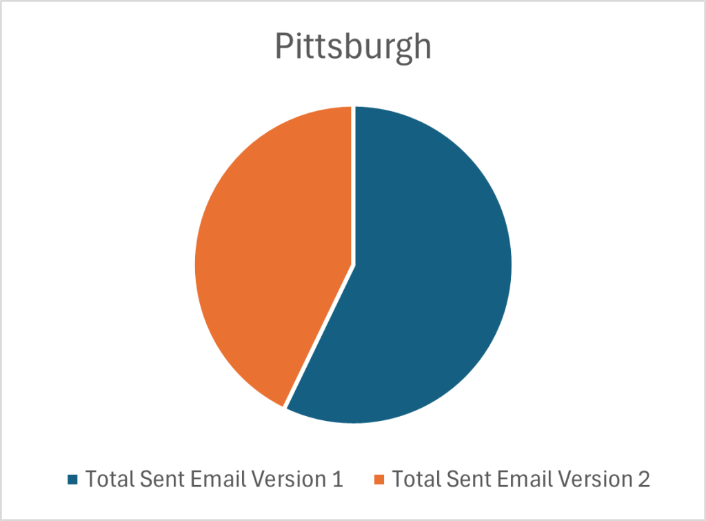
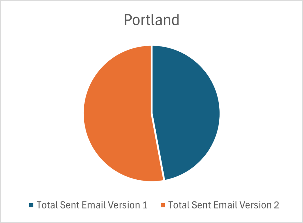
Overall, a relatively even distribution of each email was sent to each city, with some variation in Denver and Pittsburgh who both received more of Email Version 1. This means that the analysis of each email version in relation to a city is appropriate. It could even be taken a step further where each city becomes its own “data-center” and I could analyze how each email version performed in each city. But we’re taking a birdseye approach to this data set, so I will continue to generalize.
Without dredging through the weeds too much, check out some of the key data points and possible insights I’ve pulled from the summary statistics based on location:
- Denver and Billings had the highest number of email opens, while Pittsburgh only saw about half of their emails opened. Denver and Billings may be more established markets and expect content from Urban Eden.
- Billings had the highest number of clicks followed by Denver. Billings had a near even distribution of Version 1 and 2 emails, it would be interesting to see clicks per email version.
- Denver led the pack with the highest number of landing page bounces; Portland had the same number of landing page bounces as clicks, meaning everyone who clicked the link and went to the web page immediately clicked off. Denver appears to have “fallen off” the journey at the landing page stage; it may be pertinent to look further into this statistic.
- Portland and Miami had the most number of email forwards, though most locations also saw a comparable number of forwards. This is a somewhat odd statistic since the results of the campaign indicate that both Portland and Miami have some of the lowest engagement with the emails. These may be new or emerging markets and Urban Eden has not yet learned how to best capture their attention.
- Denver and Billings had the highest number of unsubscriptions, while Pittsburgh had the lowest (aka a good thing!) With high risk comes high reward – Denver and Billings account for the largest number of email recipients and higher volumes warrant more unsubscriptions. Nothing to be alarmed at yet, but definitely a statistic to monitor.
Examining the Difference in Visual Styles of Emails
Email Version 1 showcases the product that is on sale and Email Version 2 showcases a human partaking in the activity that is made possible by the product that is being advertised. Based on similar CTR’s and the equivalent location of the link in each email, the link appears to be in an appropriate location to drive customers to the desired landing page.
The biggest difference between the emails is the visual aspect; the image portrayed as the focal point. With an understanding that more customers bounced off the landing page from Email Version 2, I can draw some inferences: while customers appeared to be intrigued by the human image in the second email version, as indicated in the high CTR, they must have been unsatisfied with what was showcased on the landing page in related to what they saw in the email (as indicated by the high bounce rate).
If the email campaign imagery does not reflect the visual image and tone of the landing page there is likely a disconnect between what customers expect and what they actually see. (While there isn’t an actual landing page for this site, it would be interesting to examine the consistency with the design of the emails – was the landing page designed with a product focus like the imagery in Email Version 1 or was it more lifestyle focused such as the imagery in Email Version 2?)
Final Thoughts
As with many sets of data, there are often endless rabbit holes to fall into to truly understand the situation. Even in this totally fictional and wildly made-up scenario, there are still various paths I can point to to gather further information. But, that would be outside the bounds of my scope – I was “hired” to analyze this campaign and while collecting more data to make informed decisions is oftentimes necessary, I ain’t getting paid to do it (haha!) so that concludes the “data analysis” portion of this project.
*Just a note here – there are many more ways to handle and transform this data with more powerful tools; even something as seasoned as SQL would have sped up and allowed for more configurations of data to be analyzed. My point with conducting this particular exploration in Excel is to show the fundamentals of data analysis and that not everyone needs big shiny products to improve their processes and marketing tactics. It’s important to keep the main goal in mind – connecting with customers.
Recommendations
Well, I must say – if you just sat through the entire previous section, I applaud you! (If you got here via a jump down link, I don’t blame you just so you know). Welcome to the part everyone who is not a data analyst cares about the most – RECOMMENDATIONS!
I’m making recommendations to a small team of passionate, plant-loving enthusiasts who want to share their eco-friendly and tech-first plant products with the world. They want a few actionable “to-do’s” that they can implement in their next email campaign to continue to convert customers. (These are not C-Suite Execs making multi-billion dollar decisions – while the general structure of the recommendations would be the same, there would be a bit more involved with making recommendations to those folks than the lovely peeps at Urban Eden).
Recommendation #1: Examine your landing page and consider redesigning elements of it, such as a call-to-action.
One of the most alarming statistics was your high bounce rate. You’re getting people to open your emails, great! They seem to be receptive enough and click through to your page but don’t complete a further action, i.e., they’re not making a purchase like you intend them to. Customers are “falling off” their journey at your site. Try and extend the time your customers spend with your brand and on your landing page.
Recommendation #2: Determine the market you want to focus your efforts on – invest your resources into it.
Both Denver and Billings already make up a majority of your customer base so why not focus your marketing dollars on them? They appear to be the ones converting the most and give you the greatest value for marketing spend. If you whittle down your target audience you can get a better understanding of who your customer is and how you can best communicate with them – personalization is the name of the game! Try out some personalization automation features in your email provider hub.
Recommendation #3: Create a consistent style and tone across all digital components of a marketing campaign.
Customers appeared intrigued by the sale as indicated by high CTR’s, but did not find what they were looking for or were not compelled to make a purchase online. This was indicated by high bounce rates. Ensuring that customers are exposed to a consistent design, style, and tone across platforms when promoting a specific campaign or sale is imperative to retaining the attention of customers – if they are confused about anything, even the “feel” of the campaign, they won’t be inclined to take action.
Recommendation #4: Set some goals for yourself!
Where do you hope to be in a year with your email marketing campaign? Do you want to get more link clicks, reduce bounce rates and unsubscribe rates, or grow your email list? Figure out how you measure success to ensure you can meet your goals.
